On Boxes and Lines and Layered Design
In my previous post, Layered Design in Go, I discussed a procedure that can be used in any Go module to order the packages in an order of what depends on what, starting with the modules on the bottom that have no internal dependencies, then the modules that only depend on those, and then so on.
Conceptually it’s a useful way to think about Go modules, and any other system that similarly forbids circular imports.
Well, I found myself with a bit of dead time on a late Friday, so I decided to do what I was too lazy to do for that article and implement a program that can actually generate that chart. Although calling myself lazy is being a bit harsh on myself, as you will see, because I had a pretty good idea how that would turn out in advance.
Diagramming Layers in Go
So I wrote something that could output a Mermaid diagram based on the package imports, and this is the result:
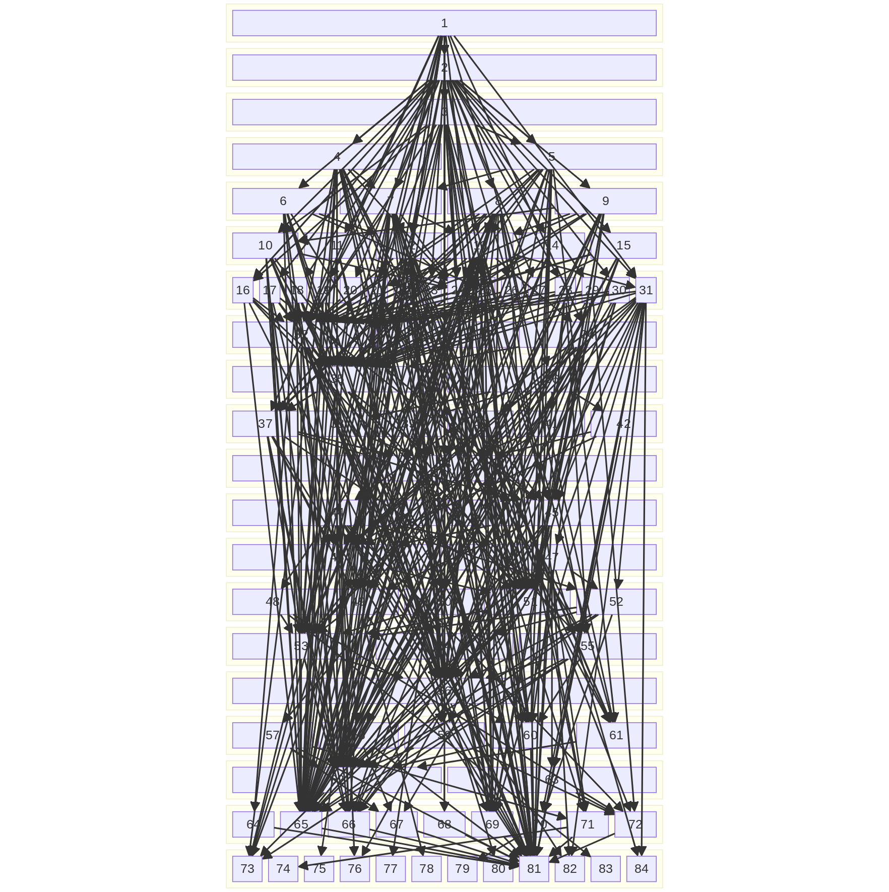
I just had to let you see the full glory of that.
(Before you throw stones, you might want to check a similar chart of your own non-trivial codebase.)
I’ve scrubbed the names off to avoid my exployer having any reason to object. I will also remind you, this is the internal structure of the project. There are no third-party or external modules in there, just the packages defined in the module containing the project. Adding the third-party modules, even just abstracting them as a single box each, would add about another 80% more boxes.
Possibly graphviz could do better, but I need something that can do that rigid layering as I have there. I don’t have a strong opinion about order within each layer, but I need the nodes to be in layers, and the layers to be in order, and I don’t immediately see a way to do that. If there is a way to do that, graphviz might do better with not stacking all the boxes on top of each other and having lines go between the boxes rather than right through them…
but I think it’s pretty clear the result would still be effectively useless. There’s no amount of massaging that diagram that will produce much understanding of the full code base.
Which segues me into…
Confession Time
Hi. I’m Jerf. I’m a software architect… and I hate system diagrams.
I don’t mean making them. I don’t enjoy that more than anybody else, but I doubt I dislike it more than anyone else either.
I mean that I hate them for their nominal purpose of conveying some sort of useful understanding of a system that is best conveyed by a diagram. I have encountered very few diagrams that meet that criterion.
There are three basic types of “boxes and lines” (as I derisively refer to them) diagrams:
-
Diagrams with very few boxes, like, maybe 5 or 6 at the most, and a few lines between them.
But these are often trivial and convey little to no information that couldn’t have been almost guessed just by knowing the boxes. There’s only so many ways to relate such few boxes.
They are frequently uselessly inaccurate too. In such diagrams, what is often more important is what boxes aren’t connected, rather than what are, but it is often the case that you still can’t count on two disconnected boxes not talking to each other, e.g., the “user auth” may be disconnected from the “DB” because it passes through some service in the middle but the odds are good that it still does in fact have a direct connection to the DB that it uses for some purposes. In practice these sorts of diagrams are often either explicitly or implicitly “everything is connected to everything” in which case the diagram in information theoretic terms degenerates to just “a list of components”; the links between them have no information.
-
Diagrams like the above, with way too many boxes for anyone to understand. Even in less pathological cases like, say, 20 boxes, with better spacing, there’s still virtually no value in the diagrams, though, because at a glance we get no useful information out of it.
I know a lot of people will argue with that, but my contention is that they feel informed, but they aren’t actually any better informed. A diagram presents an attractive target to the brain’s visual systems and invites us to feel like we have some sort of improved understanding of what is there. But the feeling is generally much stronger than the true information transfer.
-
Diagrams that hit that sweet spot somewhere around 6-12 entities, with a limited number of connections between them, where whether or not the connection exists is very reliable, and the diagram is not misleading you with oversimplification.
Even so, though, I would contend that there are so many ways for things to be connected, with important implications for understanding how the system works, that there’s still so much missing.
It also still remains the case here that in many cases, the information is not actually that interesting. I struggle to remember when I’ve seen a diagram where some link between two systems was actually surprising. If a diagram never surprises, it also doesn’t contain that much real information. The most “surprising” thing I get from most diagrams is the presence of some box I wouldn’t have anticipated, e.g., “you show an NTP server there, you have some sort of strong accurate-time dependency in your system I did not anticipate”, but the links are themselves often still not that useful.
Of these three, the only one that is even conceivably useful is the third.
Guess which is also the least common one of the three I encounter.
And it still frequently doesn’t really convey much more information than the bare set of boxes would, or just a prose list of “components of the system”.
Consequently, I don’t really like diagrams, at least as most people do them, as tools for conveying software architecture information.
But Jerf, you can just…
Yes, yes, yes, I’m aware of all the options to make them look nicer.
I too have seen hundreds of diagrams.
You can try to group subsystems into boxes of their own. You can use lots of different kinds of symbols, although that is also its own problem. You can try to do a lot of fancy things like have a hierarchy you can click into, though in that case you both diminish the “at a glance” overview these things are nominally providing as well as using features that people aren’t looking for in diagrams. Yes, I’ve scrolled through the hundreds of “things” the diagram systems provide. There’s a whole bunch of them.
All of these things extend the runway perhaps a bit. Maybe you can get away with 9 instead of 6. But it’s not enough. Once you’ve got more than about a dozen entities on a diagram it’s just not a useful overview anymore.
Diagrams! Huh! What Are They Good For?
For all that, no, my answer is not “absolutely nothing”.
Think of diagrams not as something that independently conveys information on its own terms, but as fantastic table of contents for prose system documentation. If your diagramming system permits elements to be clickable links, which many do but is often a buried feature since few people use it, using even a moderately complicated system diagram as links into a coherently-organized prose discussion of what a system is, and what the links to and from it are, and ideally, where to find the actual code implementing all these things, is a very good use of a diagram. Especially that “link to the actual code”; don’t sleep on that!
I also recommend trying to make the order of the diagram mean something. This is not always easy and there are often multiple choices, but one I often use is “whatever the dominant flow in the system is, ordered roughly temporally from left to right”.
That is, consider a standard web system that users log in to and, say, are reporting their time off to HR. The system diagram can be ordered roughly temporally from left to right in terms of what systems are activated as the user logs in, navigates to their reporting, completes a report, and that report flows through whatever other systems involve that. Even if isn’t the only flow through the system, and some other flow requires a completely different order, having an ordering to the diagram still makes it easier to fit into people’s heads even if it’s not the “correct” ordering for the reason they are currently examining the diagram.
It is often the case that you can’t do this perfectly, but the utility of this definitely has a smooth curve upwards… even if for some reason you have to put some particular element out of order, it is still a more useful diagram if there is some broad order to it rather than just “I put things down in an order that they occurred to me”.
Conclusion
There is a sense in which this post is what you might call all-natural, organic flamebait. Since most diagrams I encounter in practice match the reasons I hate diagrams, it is true that I mostly conceptualize of this in terms of hating diagrams and begrudgingly accepting good ones on the rare occasions I encounter them. The emotionally-laden framing and phrasing I’ve used here is authentic, not an affectation.
However, from a more Vulcan-esque perspective, it is fair to view this post as an exhortation to software architects to be more thoughtful about how to build system diagrams and make them useful artifacts, rather than just things we do to satisfy a management culture that falls hard for the feeling of understandings a diagram offers I described above.
Find an underlying structure for your diagrams, so that spatial relationships mean something. Temporal, left-to-right (or RTL or top-to-bottom as is appropriate in your culture) is a good default but it’s not the only option. Use the diagrams as links into “real” documentation, and then make sure that real documentation is also heavily linked as far as possible, ideally all the way down to references to code, as specific as possible. The more breadcrumbs you leave, the more likely someone is going to be able to pick up the path three years later, after the diagram itself is out of date. Normally an out-of-date diagram is more hazard than help, but if the diagram is just one part of a whole bunch of well-linked information it can still end up being more useful than your usual “old diagram that misinforms more than it informs”.
I really want to emphasize the importance of actively linking the prose content into the diagram as much as possible. True web links are ideal, even if you have to explain that to the viewer. Even a diagram accompanied by solid prose, but where you have to constantly and manually scroll back and forth to match the two things up, is much less useful. Affordances matter.
(In a perfect world, the diagrams would have some way to link back into them that specially highlights a particular entity or set of entities, so the prose could have a full bi-directional link back into the diagram as well as the diagram linking straight to the appropriate prose.)
Forget trying to make the diagram convey anything useful “at a glance”. Make it useful these other ways. As a side effect, the resulting diagram will probably be even more useful “at a glance” than one nominally optimized for that purpose! Even if your viewers don’t consciously pick up on the organization, they will subconsciously pick it up.
If you find yourself offended at my generalizations about the uselessness of diagrams or their inability to convey much useful information, the remedy I suggest is to make your diagrams more useful in these ways, and others you may come up with yourself. If I encountered this sort of useful diagram all the time I never would have written this post.
And of course there is the occasional stellar diagram I encounter that is very well done. It’s just that those are clearly the exceptions rather than the rule. And since I practice what I preach here, I notice that I invariably have to explain to viewers what I’ve done, so it’s pretty obvious almost nobody is doing these things in practice because in the real world nobody expects diagrams to have the features that make them useful.